Saturday, February 28, 2009

The 5 recent rebrands that caused the most upset.


http://logodesignerblog.com/5-recent-rebrands-that-caused-the-most-upset/

22 Random Things About Graphic Design

Found on 'Design+Writing = Blog'..

1. Claude Garamond, publisher and legendary type designer responsible for designing the letterforms that led to some of the most widely used typefaces throughout history, died in poverty at age eighty-one.

2. The Michelin man has a name, Monsieur Bibendum. He’s also a century old.

3. The Nike swoosh was designed by Carolyn Davidson in 1971, while she was a student at Portland State University. She was paid $35.

4. Woody Allen uses the same typeface in the titles and credits of nearly all of his movies. The typeface is Windsor.

5. Peretz Rosenbaum is one of the most influential graphic designers of the 20th century. He is responsible for the IBM logo, the old and arguably most recognizable UPS logo, the Westinghouse logo, and many other design icons. You know him as Paul Rand.

6. According to Salary.com, the median salary for a graphic designer in the United States is $45,704.

7. The worlds first website(as we know them today) was launched in 1992. You can still visit the URL here.

8. What we now call sans-serif typefaces were once known by a number of names: Egyptian, Antique, Grotesque, Doric, Heiti, Lineale, and Simplices. I think sans-serif works just fine, thank you.

9. Walker, the sans-serif typeface designed by Matthew Carter for the Walker Arts Center has up to 5 “snap-on” serifs that can be attached to each letterform using keystroke commands.

10. Georgia, another typeface designed by Matthew Carter, is named after a tabloid headline which reads “Alien heads found in Georgia.”

11. Baseline magazine, first published in 1979, was originally intended to be a promotion vehicle for new typeface designs.

12. Newly defunct The Designers Republic was hired to design the in-game artwork, packaging and manual for The Wipeout video game series as part of a carefully marketed ploy to position the game among the “fashionable, club-going, music-buying” audience the publisher was trying to attract. The results make Wipeout games some of the most visually stunning ever.

13. Due to the incompatibility of the letterforms in the title of Avant Garde magazine, Herb Lubalin first created the typeface Avant Garde, with its many ligatures, out of necessity. It wasn’t until later that he created a full set of glyphs.

14. The term “Web 2.0” emerged sometime in 2002 (despite the claim that Tim O’ Reilly coined it in 2005) with Dermot A. McCormack’s book Web 2.0: the Future of the Internet. . .

15. The Coca-Cola logo was made using a style of hand lettering called Spencerian Script.

16. Jerry West is the silhouetted player in the NBA logo.

17. The late Tibor Kalman once had a party in a supermarket to commemorate the arrival of his book Tibor Kalman: Perverse Optimist. As party favors, he gave guests signed canned goods.

18. The Great Seal of the United States was designed in the 1770’s by the then secretary of congress, Charles Thomson.

19. The Red Cross is known as The Red Crescent in Muslim countries. Its logo also changes from a cross to a crescent.

20. Raymond Loewy, known primarily as an industrial designer, also designed a crap-ton of logos including the logos for Hoover Vacuums, Exxon, and Shell.

21. Facebook uses a modified version of the typeface Klavika for its logo.

22. Myspace, Arial Rounded Bold.

Recompute


http://www.core77.com/greenergadgets/entry.php?projectid=32

DESCRIPTION
Recompute is a new way of thinking about computers that layers sustainable ideas throughout its lifecycle to make an overall sustainable product that can be easily replicated. Recompute address sustainability along three main points during its life.

Manufacturing: Rather than making a large tower constructed from numerous materials (ABS plastic, aluminum, steel, etc.), hundreds of manufacturing processes, and dozens of individual components, the Recompute case is made of corrugated cardboard (recyclable and renewable). There are four low-impact manufacturing processes to assemble Recompute: Die cutting, gluing (with non-toxic white glue), printing and electronic assembly. Recompute uses only three major electronic components: A motherboard with processor & memory, power supply, and a hard drive.

Use: Recompute is designed to allow the user to take advantage of existing hardware. For example; use the keyboard from a previous computer. For additional flexibility, external hardware customization is easy via 8 USB ports.

Disposal: Electronic components need to be properly recycled as they contain toxic heavy metals. However, this is often skipped because dismantling of computers is difficult. Recompute can be disassembled without tools, so the electronics and case can be easily recycled individually.

Oh yes, Recompute is a real working computer.

Cristiana Couceiro's work


http://setediasete.blogspot.com/

times square pedestrian-only??


thoughts?

Wednesday, February 25, 2009

The works of Letman


http://www.letman.com/#OLD_=_NEW_

Poster Boy and MoMa's subway ads


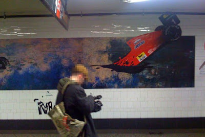
Have you all been enjoying that MoMA installation (ad campaign) at the Atlantic/Pacific stop in Brooklyn? Well, it just got a little bit Picasso on us, so you may want to take another look. NYMag reports that Poster Boy and Aakash Nihalani have altered the classic works. However, there is question as to whether proof this "vandalism," that took place this past Saturday at 2 a.m., was all part of the master plan.

Saturday, February 21, 2009

Christian Ward's work


http://www.cwardillustration.com/

Wedding invite


http://www.beastpieces.com/2009/02/wedding-invite-letterpress-gocco-stitch/

Wilhelm Staehle's work


http://silhouettemasterpiecetheatre.com/

http://wilhelmstaehle.com/

The Credit Crisis visualized..


"The Credit of Crisis - Visualized" [crisisofcredit.com] by Jonathan Jarvis

watch it here: http://infosthetics.com/archives/2009/02/the_credit_crisis_visualized_in_animated_infographics.html

Experimental work by Bechira Sorin


http://designyoutrust.com/2008/11/18/one/

NYTimes article skimmer


http://prototype.nytimes.com/gst/articleSkimmer/

Rios Illustration Ads...


Custom Logos


http://www.lettercult.com/logos

Visualizing the News


A series of visualizations [flickr.com] that represent the top organizations and people mentioned in the news articles of the New York Times for a given year of news between 1984 and 2009. Connections between these entities are drawn, so that relationships can be found and followed. These circular graphs are based on the faceted searching abilities of the NYTimes Article Search API, that were released a short while ago.

http://infosthetics.com/archives/2009/02/nytimes_yearly_visual_overview.html

http://blog.blprnt.com/blog/blprnt/nyt-this-was-1984
Jer Thorp's blog

Tuesday, February 17, 2009

MoMA identity redesign

http://pentagram.com/en/new/2009/02/new-work-the-museum-of-modern.php#more


Along with the many signature artworks in its collection, The Museum of Modern Art (MoMA) possesses one of the most recognizable logotypes of any cultural institution in the world. In recent years, however, the application of this identity across the museum’s broader graphics program has been indistinct. Now MoMA has recast its identity, building on its familiar logotype to create a powerful and cohesive institutional voice. The new graphic identity has been designed by Paula Scher, and further developed and applied by Julia Hoffmann, MoMA’s Creative Director for Graphics and Advertising (and a Pentagram alumna).

While the MoMA logo is iconic, it alone is not enough to continually carry the spirit of the institution. An organized and flexible system was required that would support program material across print, web and environmental applications. The new system designed by Scher and Hoffmann employs prominent use of the MoMA logo as a graphic device, dramatic cropping and juxtapositions of artwork, and a brighter color palette to create a bold, contemporary image. The identity also underscores the museum’s leadership role in the field of design.

A look at the new identity after the jump. All pictured applications designed by Julia Hoffmann and her team at MoMA.

Air France logo redesign


Air France Reveals Updated Logo: an International Brand with a French Identity
Air France's visual identity is changing.

The new logo - designed by the Brandimage agency - is now just one word, highlighting Air France's ambition to be an international brand since over half of Air France's customer base is located outside of France.

The national colours (blue, white and red) remain present on the aircraft's tail fin and fuselage, underlining not just the airline's French identity, but also its values and history which it has been proudly displaying for the past 75 years.