Friday, June 27, 2008

free gas???!! ... wait in line


http://edition.cnn.com/video/#/video/us/2008/06/27/vo.free.gas.line.wsvn?iref=videosearch

barack and hillary UNITE


haha

behind every great man is a great woman?


Should Michelle Obama and Cindy McCain be getting so much media attention lately? I watched 'The View' last week when Mrs. O was a guest, thought she was great! Michelle Obama co-hosted the view with Barbara Walters, Whoopi Goldberg, Joy Behar, Elisabeth Hasselbeck, and Sherri Shepherd.
Take a look:
http://www.youtube.com/watch?v=59twO1fJwtQ


Michelle is also constantly being compared to Jackie O. It looks like Michelle gets much more media heat because she is your non-traditional First Lady.


Check out what others have to say:
http://www.alternet.org/reproductivejustice/88942/?ses=fcaac7e13d3890d3197391c282185a07
http://campaignstops.blogs.nytimes.com/2008/06/26/married-to-the-mob/index.html?ref=opinion
http://elections.foxnews.com/2008/06/19/spouses-launch-image-campaigns/
http://firstread.msnbc.msn.com/archive/2008/06/18/1152735.aspx
http://www.eyesonobama.com/blog/content/id_21415/title_Cindy-McCain-vs-Michelle-Obama-is-like-PBJ--vs-Cream-Cheese-and-Jelly/
http://www.nydailynews.com/news/politics/2008/06/22/2008-06-22_while_michelle_obama_has_been_front_and_-1.html
http://www.usnews.com/articles/news/campaign-2008/2008/06/23/while-michelle-obama-has-been-front-and-center-cindy-mccain-is-a-mystery.html
http://www.cnn.com/2008/POLITICS/06/11/first.ladies/index.html
http://afp.google.com/article/ALeqM5hTvb2LusV4T38bXKfuBVqcsHBHxQ

Tuesday, June 24, 2008

the image says it all


A Jewish supporter expressing his support at Congregation Rodeph Shalom in Philadelphia in 2008.
I know I discussed the different t-shirts in an earlier post..but this? People find many ways to show their support.
Just by slapping on Obama's political brand to a shirt you already stand out, but interfering with religious elements?.. must really be a big supporter..

Saturday, June 21, 2008

"the loser's club"


haha please watch this.. feel free to comment

http://video.aol.com/video-detail/zimbabwe-political-ads/681891836

R.G. Mugabe Campaign Ad...what is the message being sent here huh? He's portraying these figures because they connote Zimbabwe being colonized once again... check it out

Tuesday, June 17, 2008

Obamania in Europe


Notice the adoption of Obama's 'Yes we can' slogan...

Obamania has gripped most of Europe. But the enthusiasm is particularly striking in France.
...Obama is a big hit.
http://www.nytimes.com/2008/06/17/arts/17abroad.html?_r=1&th&emc=th&oref=slogin

And Germany...


And Scotland...


Watch this video to get a glimpse of this European Obamania..
http://www.cnn.com/video/#/video/politics/2008/06/16/quijano.euro.obamamania.cnn?iref=videosearch

Check these out as well:
http://worldmeets.us/lemonde0000175.shtml
http://www.iht.com/articles/2008/06/06/europe/obamania.php
http://www.brusselsjournal.com/node/2920
http://my.barackobama.com/page/community/post/obamania2008/CGgKQ

Thoughts? Immigration have anything to do with it? Should they be supporting McCain more since his policies are similar to many applied policies in Europe? Why is Europe so involved and affected by the US presidential elections?

Monday, June 16, 2008

RIP Polaroids


http://www.aiga.org/content.cfm/gone-in-sixty-seconds

Explore google too and learn more: http://www.google.com/search?client=safari&rls=en&q=polaroid+end&ie=UTF-8&oe=UTF-8

What do you think about this?

what's in a face?

From far away I thought Chuck Close...but if you get closer... (check it out at the moma)


times square billboards

Walking around and through times square makes you think...what's the story behind these supergraphics? So I decided to do some research...


The Theaters of Broadway and the huge number of animated neon and LED signs have long made it one of New York's iconic images, and a symbol of the intensely urban aspects of Manhattan. Times Square is the only neighborhood with zoning ordinances requiring building owners to display illuminated signs. The density of illuminated signs in Times Square now rivals that of Las Vegas. Officially, signs in Times Square are called "spectaculars", and the largest of them are called "jumbotrons." http://en.wikipedia.org/wiki/Times_Square

I took these last night...


See this website for some background info:
http://www.agilitynut.com/signs/7.html

Hershey store signage: Outside, the 215-ft tall, 60-ft wide store facade is the largest permanent fixture ever constructed in Times Square. Featuring 34 dimensional props, four steam machines, over 4,000 chasing lights, 30 programmable lights, 56 neon letters, 14 front-lit signs, and every major signage technique used today. http://www.hersheys.com/discover/timessquare.asp

Check these out:
http://www.timessquaresigns.com/
http://www.newyorker.com/archive/2004/03/22/040322crat_atlarge
http://query.nytimes.com/gst/fullpage.html?res=9D0CE3DC123AF931A35755C0A967958260
http://www.designnews.com/article/CA6544185.html
http://blueverticalstudio.com/go/?p=1101
http://www.medialifemagazine.com/news2001/jan01/jan29/1_mon/news5monday.html

Friday, June 13, 2008

pay attention to the everyday

Ever look around you as you walk down the street? hop on the subway? do your groceries? or even...while you're finding your way to the closest bathroom?

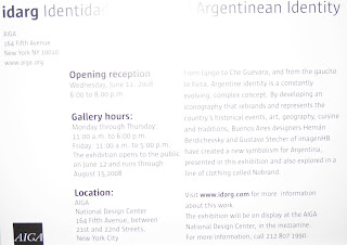
I went to an opening of an exhibit on Wednesday at AIGA ny. Two exhibits were going on: Everyday Design: Great Finds from Around the World and idarg Identidad Argentina | Argentinean Identity.

Personally, I really enjoyed the first one as it brought together images of ordinary objects from around the world, providing me with the ability to directly compare the use of type/design of different products from various countries including France, Ghana, Japan, Spain, among many others. These series of photographs also invited the public to experience glimpses into daily lives of people across the globe in the space of a single room. The set up was simple: a horizontal grid containing various (maybe 6) photographs and one square with the name of the country where the photos were taken.


I started thinking.... my knowledge of type and design really only applies to a select few Western languages... When looking at the photographs taken in Japan for example, the type used, which I am not as familiar with, seemed foreign to me in terms of how to approach each character (eg. if a line should go a certain way; the space between lines or characters; the x-height etc) I had never really thought of that before. Of course, I can still decide if I like the 'look' of it but still.. It was also fun to notice similarities and differences between the same products but differing by country. To me, the design is a unifying voice across the globe. For example, many pictures were taken of milk cartons and detergent around the world. It's interesting to see how each country treats the packaging. What's funny is that the average person doesn't necessarily take notice of the everyday in terms of its design. What they don't know is that it actually plays a big role psychologically I feel. You usually are more prone to pick a product based on its design. Maybe your mom used to buy a certain brand of milk and you still buy it today... or maybe you just recognize this brand as opposed to that brand because it has been well advertised. Who knows.. In any case, design is important.


This thoughtful display of images will encourage visitors to make their own comparisons and be inspired by materials not traditionally considered “designed” objects. Inspiration. Design. Everyday. Who knew that design could connect you to other countries, other people, other cultures.

On that note, the second exhibit was all about one culture and identity: being Argentinean. Two Buenos Aires designers decided to develop an iconography that rebrands and represents the country's historical events, art, geography, cuisine and traditions. This project also sparked a line of clothing called Nobrand. I was interested in seeing how they took such a complex culture and narrowed it down to a certain number of icons. Who decides what represents a culture? Is the series fully representative? Is it true to its culture? Thoughts? Basically we're talking 'Being Argentinean for Dummies: In 50 icons'. Ok that sounds negative but I'm just saying.. Some icons I liked more than others, all small illustrations; I liked how they were displayed. A few were selected to be made bigger and each was provided by an explanation in Spanish and English of course of what that symbol represented. EXCEPT for tango. ha I guess there are no words.... I thought it was clever. Shirts, as well as keychains, were also on display with the various icons on them or incorporated in their design somehow.


Actually, these designers reinterpreted the familiar Che Guevara t-shirts. I wonder if they will replace the recognizable ones.. Keep an eye out!


Check out these links:
http://www.everydaydesign.org/index.html
http://www.aiga.org/content.cfm/exhibit-everyday-design
http://www.aiga.org/content.cfm/exhibit-idarg

Sunday, June 1, 2008

got a design?

I watched hours of CNN last night and saw a quick mention of the t-shirts supporting each candidate. In my opinion, candidate supporters wear these t-shirts the same way sports fans wear theirs. The trick for the designer of the t-shirt is that one should be able take a glimpse of the shirt/notice the distinct colors or logo from afar and be able to immediately associate it to the presidential candidate.

First there are the obvious t-shirts that can be made from the candidate's political branding (which I discussed in my previous blog), which simply consists of stamping the t-shirt with their brand. Most of these are recognizable by now by the average american for sure. But after watching this CNN highlight I decided to explore the three candidate's online stores a bit further. It's interesting because one would think each candidate would want to stand out with some kind of original idea. But the truth is, the various products in our consumer culture are being used to propagate the candidates’ images (and get free advertising) and often overlap with ideas.

The first thing I noticed was Obama's state t-shirts concept ( http://store.barackobama.com/Shirts_s/1017.htm ). The design is simple and consistent with Obama's visual imagery, incorporating within the letters the familiar 'Red-White-Blue sunrise at horizon evoking change/hope' logo. But then, looking through the different states on the site, I realized that some states were missing. So then I thought, maybe the shirts were only made for states where Obama won the primaries. But states like Wyoming, Washington, South Carolina I could not find on the site. Why exclude them?


I did notice a lot of overlap between the candidates. Obama and Clinton ( http://www.hillarystore.com/ )use the same dark blue look for their popular t-shirts.


Also, all three candidates tap into the infant/women category with similar looking merchandise. It's interesting because in the designer world, designing children apparel/products has always been challenging. Does one maintain the branding image used on other products and stay consistent, or rather does one try to appeal to a younger eye (usually done quite stereotypically; eg. more handwritten, kid-like typefaces, select colors etc.) I noticed that both McCain and Hillary come up with complete new brands on the infant apparel. Frankly, quite ugly.


The funniest overlap to me was the use of the 'got milk?' campaign style. Both Obama and Clinton step away from their political branding typefaces and use the very familiar 'got milk' typeface. Obama writes: 'got hope?' while Clinton writes: 'got experience?'. Talk about originality...


As much as I hate to say it (I am a democrat..), McCain's store ( http://store.johnmccain.com/ ) is quite successful in terms of standing out. He has a whole 'green' category with sustainable eco-friendly apparel. I'm surprised the democrats do not. Also, prices aside, he's the only one tapping into polo shirts, which appeals to a certain crowd, rather than sticking to typical men/women standard t-shirts.


I also saw that most of Clinton's shirts in her store are pretty much made to fit only women (haha WHY???) I mean I know being a woman plays a big part in her political image but..it's strange.. Although, with just a few days left before votes in South Dakota and Montana end the Democratic nomination fight (or at least the pledged delegates portion of said race), the campaign of Clinton held a t-shirt design competition to choose its official t-shirt. The top five chosen ( http://www.hillaryclinton.com/action/tshirtvoting/?sc=8 ) from the thousands that were sent in are all pretty ugly and original if you ask me. Really though, how often is the andy warhol silkscreen style used? What do you think? Is that a bad thing? The public is allowed to go on that site and vote from the 5, pick 1. In my opinion, this competition should have been held much earlier.


Finally, I was looking at Clinton posters and it seems strangely familiar to the popular Obama poster (see previous post) done by artist Shepard Fairey. Here, famous Hollywood screenwriter Tony Puryear gives it a try, but I think from a design point of view, it is not appealing at all. Obama wins that one.


What would you like to see with your favorite candidate's name on it?? Thoughts?

See what other have to say:
http://campaignstops.blogs.nytimes.com/2008/05/04/from-mousepads-to-piggy-banks/#comments
http://blog.washingtonpost.com/thefix/2008/05/fixcam_clintons_tshirt_competi.html?hpid=topnews