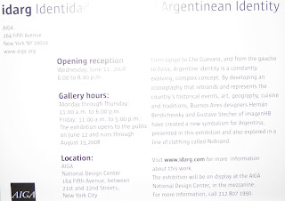
I went to an opening of an exhibit on Wednesday at AIGA ny. Two exhibits were going on: Everyday Design: Great Finds from Around the World and idarg Identidad Argentina | Argentinean Identity.
Personally, I really enjoyed the first one as it brought together images of ordinary objects from around the world, providing me with the ability to directly compare the use of type/design of different products from various countries including France, Ghana, Japan, Spain, among many others. These series of photographs also invited the public to experience glimpses into daily lives of people across the globe in the space of a single room. The set up was simple: a horizontal grid containing various (maybe 6) photographs and one square with the name of the country where the photos were taken.


I started thinking.... my knowledge of type and design really only applies to a select few Western languages... When looking at the photographs taken in Japan for example, the type used, which I am not as familiar with, seemed foreign to me in terms of how to approach each character (eg. if a line should go a certain way; the space between lines or characters; the x-height etc) I had never really thought of that before. Of course, I can still decide if I like the 'look' of it but still.. It was also fun to notice similarities and differences between the same products but differing by country. To me, the design is a unifying voice across the globe. For example, many pictures were taken of milk cartons and detergent around the world. It's interesting to see how each country treats the packaging. What's funny is that the average person doesn't necessarily take notice of the everyday in terms of its design. What they don't know is that it actually plays a big role psychologically I feel. You usually are more prone to pick a product based on its design. Maybe your mom used to buy a certain brand of milk and you still buy it today... or maybe you just recognize this brand as opposed to that brand because it has been well advertised. Who knows.. In any case, design is important.

This thoughtful display of images will encourage visitors to make their own comparisons and be inspired by materials not traditionally considered “designed” objects. Inspiration. Design. Everyday. Who knew that design could connect you to other countries, other people, other cultures.
On that note, the second exhibit was all about one culture and identity: being Argentinean. Two Buenos Aires designers decided to develop an iconography that rebrands and represents the country's historical events, art, geography, cuisine and traditions. This project also sparked a line of clothing called Nobrand. I was interested in seeing how they took such a complex culture and narrowed it down to a certain number of icons. Who decides what represents a culture? Is the series fully representative? Is it true to its culture? Thoughts? Basically we're talking 'Being Argentinean for Dummies: In 50 icons'. Ok that sounds negative but I'm just saying.. Some icons I liked more than others, all small illustrations; I liked how they were displayed. A few were selected to be made bigger and each was provided by an explanation in Spanish and English of course of what that symbol represented. EXCEPT for tango. ha I guess there are no words.... I thought it was clever. Shirts, as well as keychains, were also on display with the various icons on them or incorporated in their design somehow.


Actually, these designers reinterpreted the familiar Che Guevara t-shirts. I wonder if they will replace the recognizable ones.. Keep an eye out!

Check out these links:
http://www.everydaydesign.org/index.html
http://www.aiga.org/content.cfm/exhibit-everyday-design
http://www.aiga.org/content.cfm/exhibit-idarg
No comments:
Post a Comment